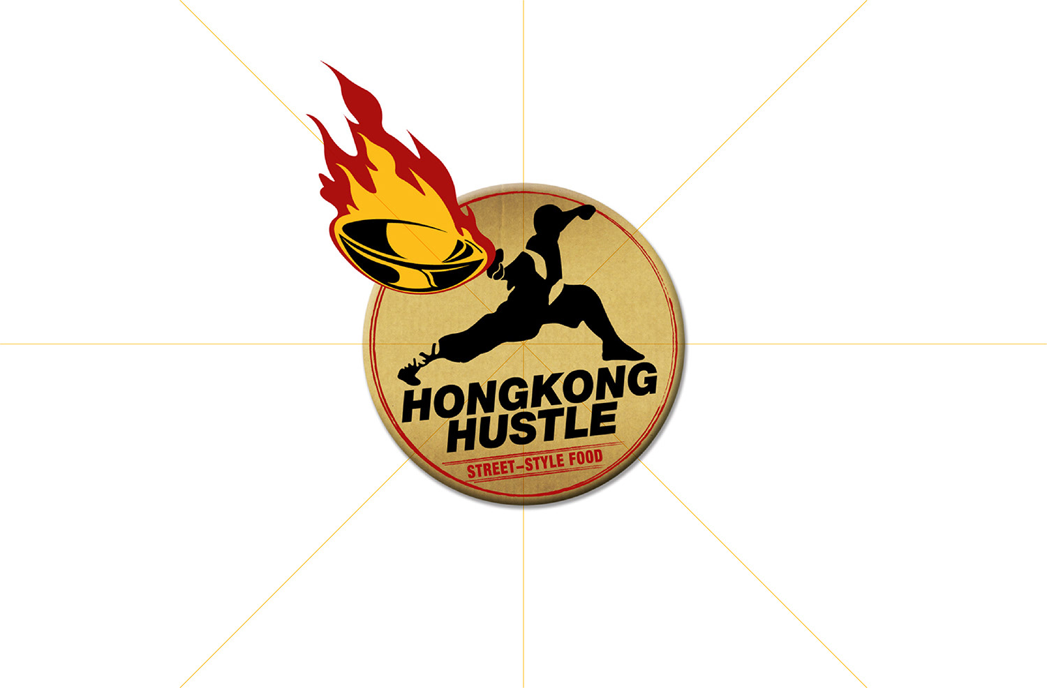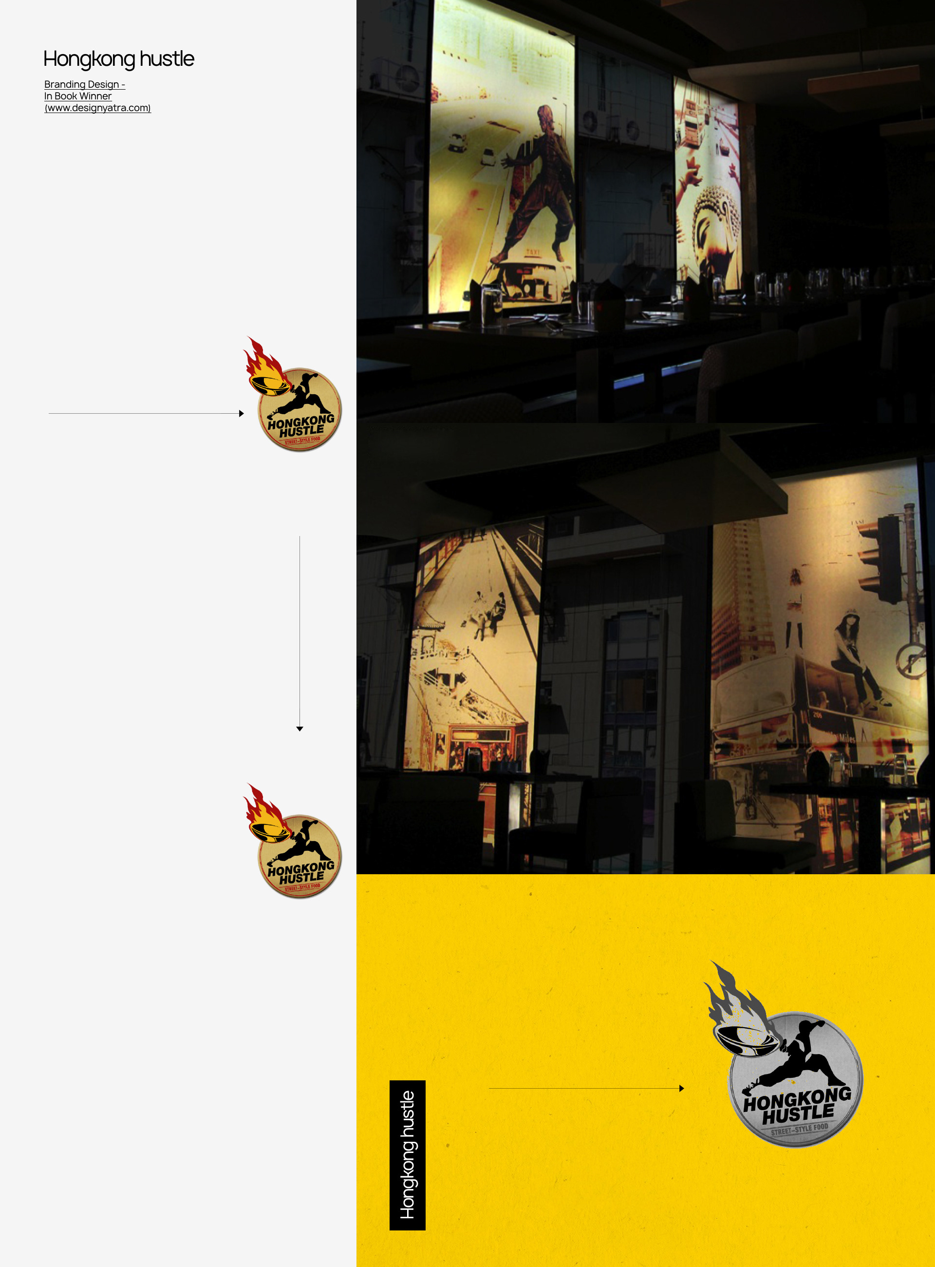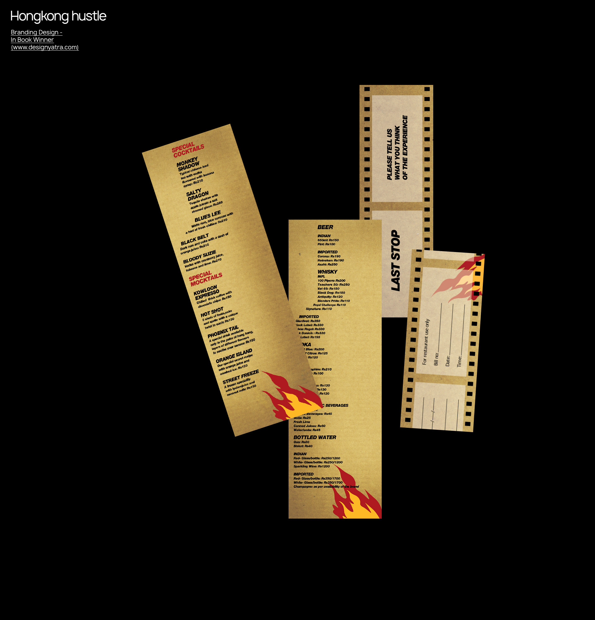
Seed: the was simple. To position HongKong Hustle as an authentic expression of Hong Kong’s street‑style food culture while creating a distinctive sit‑down dining experience. Nourishment: What grabbed us first was the speed. Hong Kong moves fast but the TA moved faster, making the restaurant’s vision feel instantly at home. So we leaned into that rhythm with a window‑shopping experience, see‑it‑check‑it ordering style (on countertop boards) that felt as natural as weaving through a Hong Kong street market. And when it launched, it blew up in the best way possible. The zig‑zagging conveyor display’s and kung‑fu‑quick waiters turned the whole experience into pure, joyful chaos. The logo: The logo shows a traditional Far Eastern cook holding an authentic wok, capturing the grit and street spirit of Hong Kong food culture in a single glance. The martial‑arts‑inspired posture signals speed and discipline, the kind people instantly recognise and respect. It carries the energy of a chef already mid‑rush, serving the hungry in the chaos of a bustling street. The look, the motion, and the attitude all work together to express action, flavour, and urgency.”